Cluke
Here’s the visual identity created for Cluke — an e-shop for upcycled sunglasses.
Why this concept?
The project started from a simple observation: many perfectly good sunglasses are returned to optical stores. In today’s economic, environmental, and health context, finding an alternative to this waste just made sense.
Brand vision
Cluke was born with the idea of creating an e-commerce platform dedicated to reconditioned sunglasses — with the goal of reducing waste and making designer frames more accessible to those who can’t afford them new. The brand advocates for conscious consumption and stands against fast fashion.
Visual identity breakdown
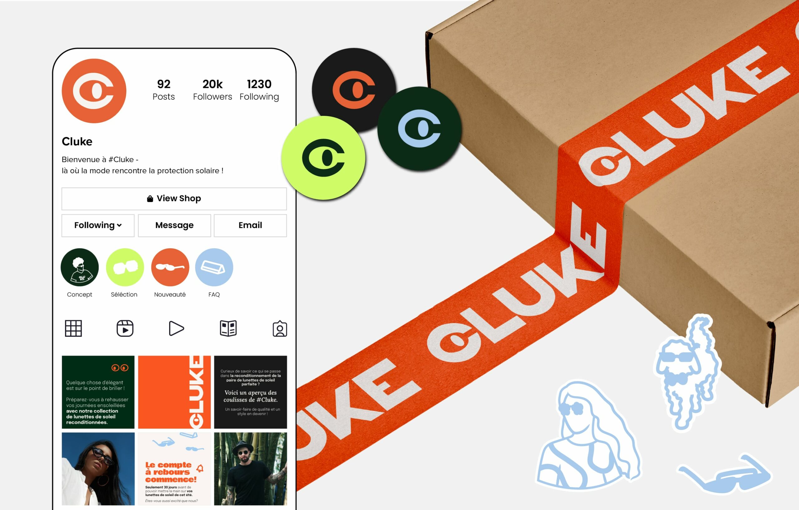
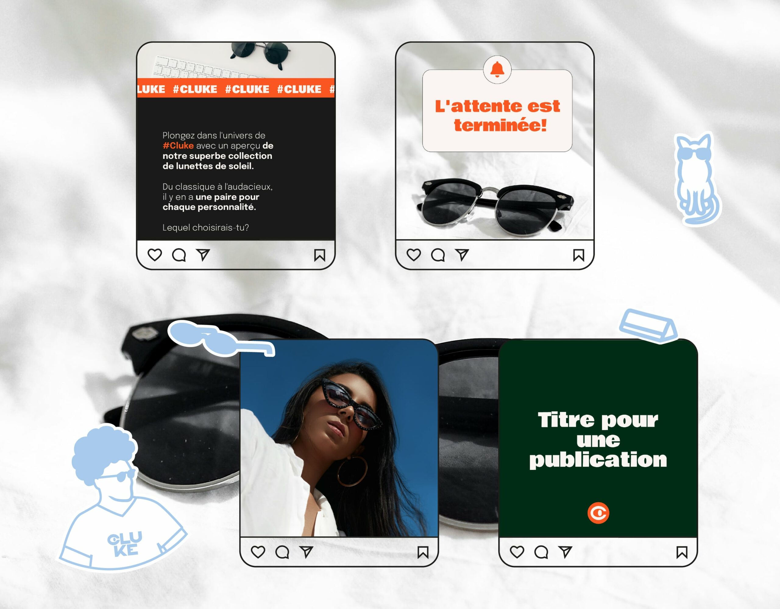
From a branding perspective, the goal was to reflect Cluke’s commitment to innovation and sustainability in a way that felt bold and different.
Instead of going for the usual neutral or pastel tones typically associated with “eco-friendly” brands, we chose vibrant, high-contrast colors like bright orange, black, deep green, neon green, and blue to inject energy and personality into the visual language.
For typography, we went totally off the beaten path — stepping away from what’s expected in the eyewear market. The bold Bowlby font was selected for titles, bringing a modern and daring twist. To balance it, we paired it with Lora for subtitles — its softer, more classic vibe creates a nice visual contrast and an engaging hierarchy.
Together, these elements form a visual identity that not only grabs attention but also brings Cluke’s values to life: innovation, quality, commitment, and a close relationship with its community.
We wanted a brand identity that breaks the mold — and Cluke owns it.