Lily Bloom’s
Here is the creation of the visual identity for Lily’s Bloom, a flower shop inspired by Lily Bloom from the book « It End With Us » by Colleen Hoover.
Why this concept?
- I LOVED this book. I think it’s my favorite by Colleen Hoover, I highly recommend it!
- The brand’s vision aligns 100% with my branding vision: having a brand identity that breaks the norms.
I had to create this brand’s visual identity! It was amazing to bring a brand concept from a book to life. It allowed me to visualize what I had read and, most importantly, see “in real life” what I had imagined.
Brand Vision
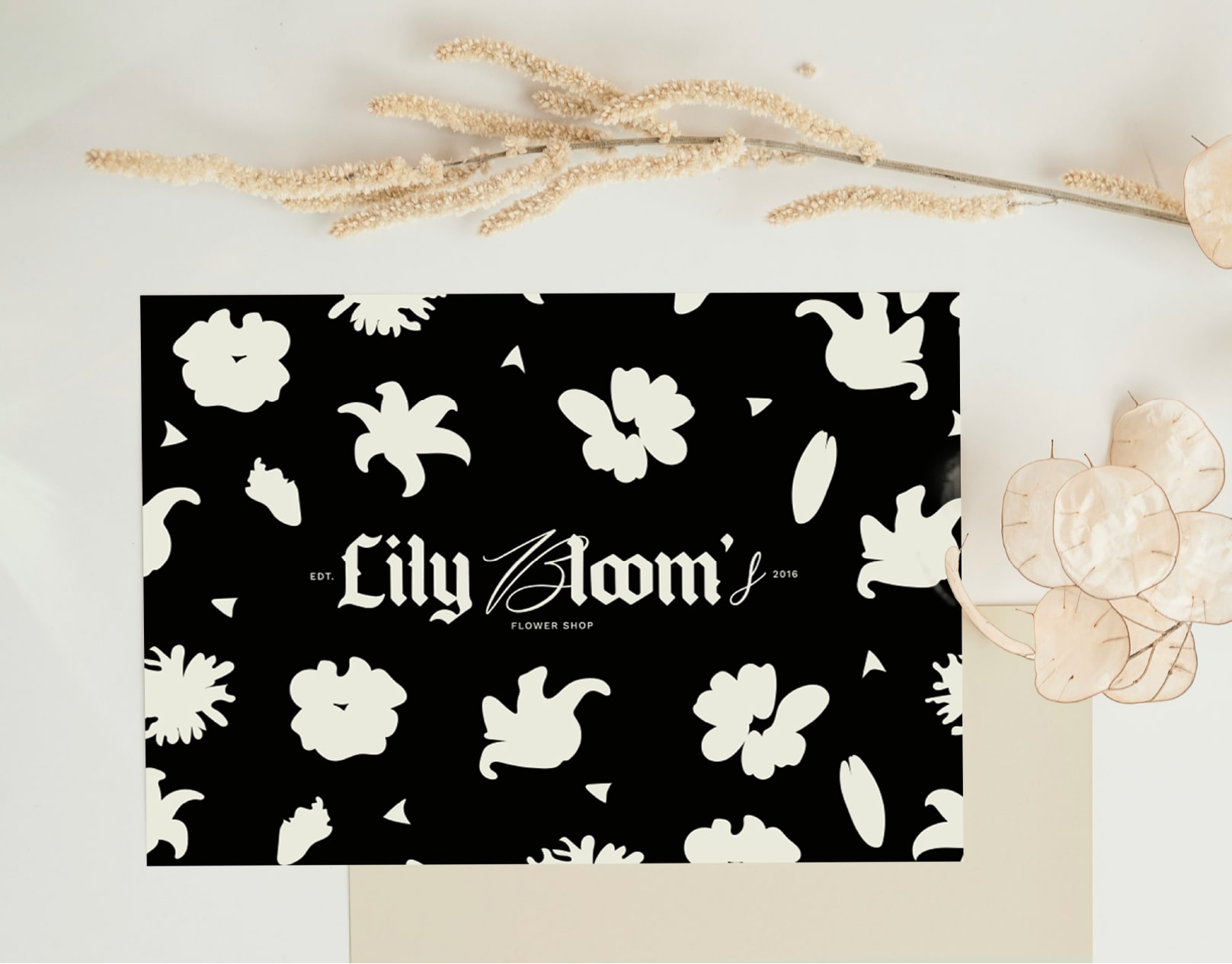
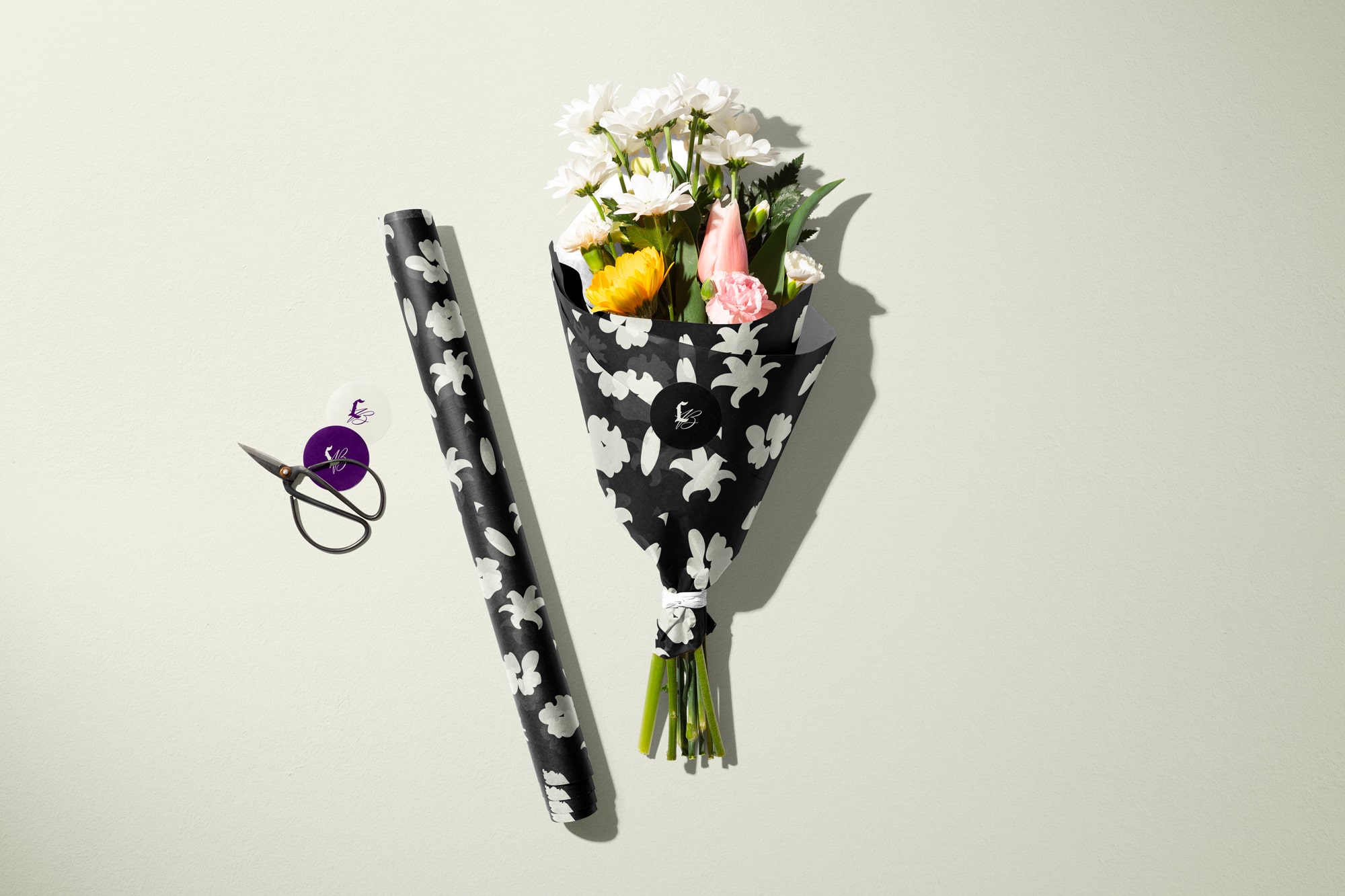
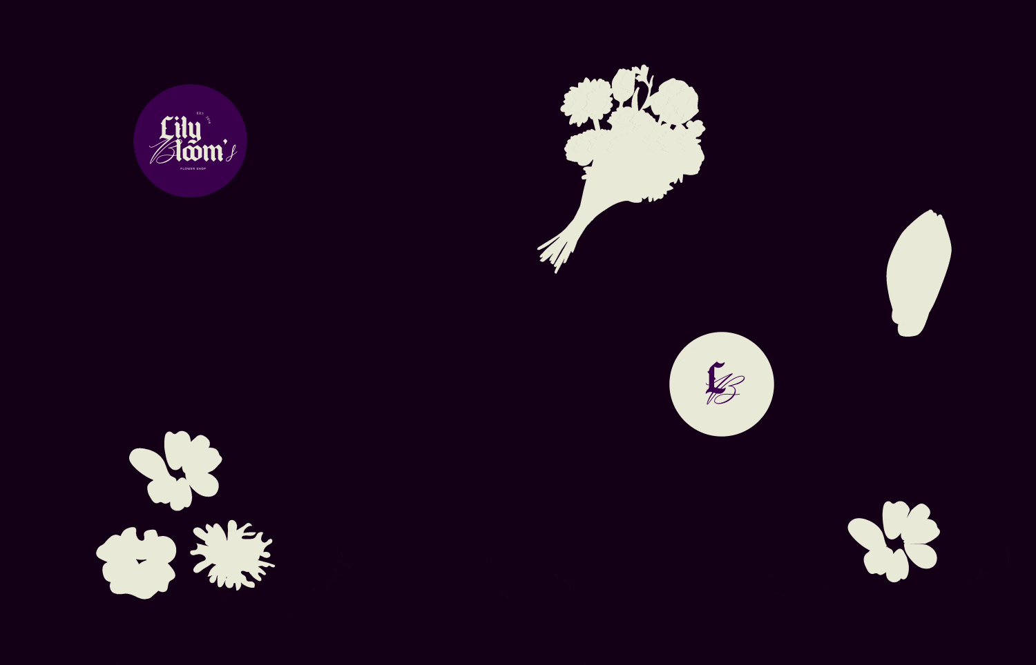
The idea was to create a flower shop that’s different from the usual, going against the norms. We wanted to show the dark, sad, and sharp side of flowers, alongside the beautiful, soft, and romantic side that’s typically seen in florists.
It’s a mix of good and bad, but most importantly, a vision to stand out in the market.
Visual Identity Creation Analysis
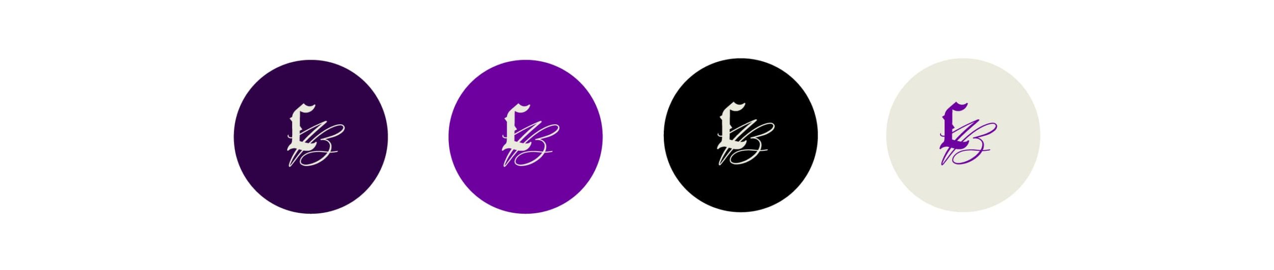
Regarding the theme, the goal was to showcase the less conventional side of flowers. For the colors, instead of using brown/green shades often associated with plants and nature or pink to evoke softness/romance, we opted for dark colors like black and deep purple.
For typography, we made choices totally different from what’s usually seen in florists. I chose a Gothic font to represent the edgy side of the brand, adding thorns to evoke the sharpness of roses. In complement, a handwritten font was added to soften the overall feel and provide contrast with the Gothic font. In fact, these are two “opposing” fonts.