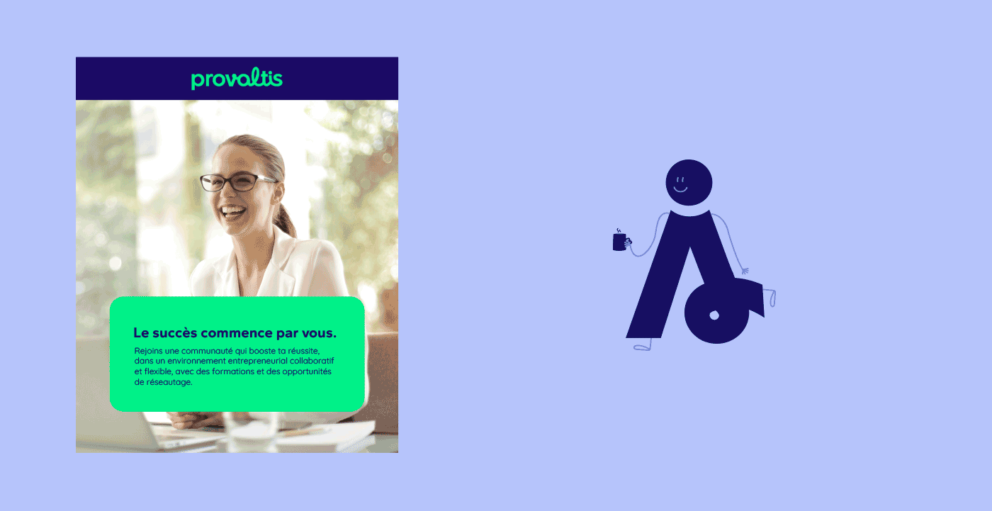
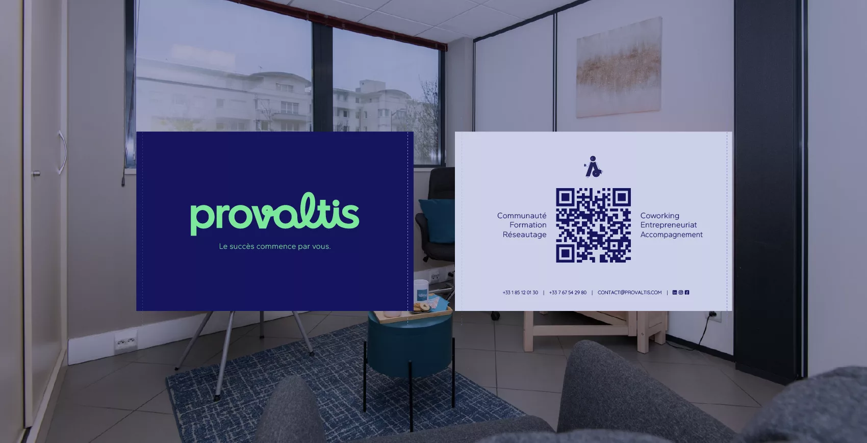
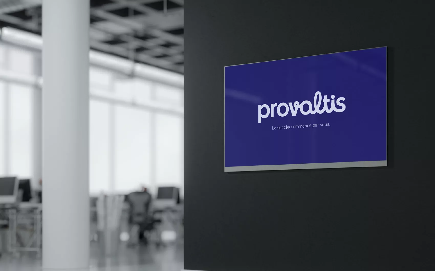
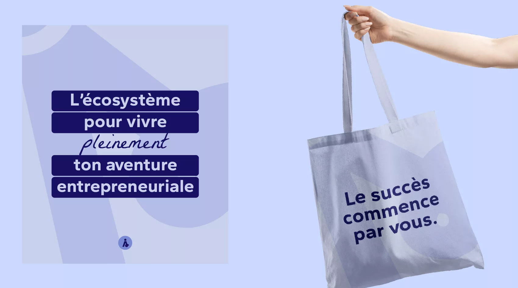
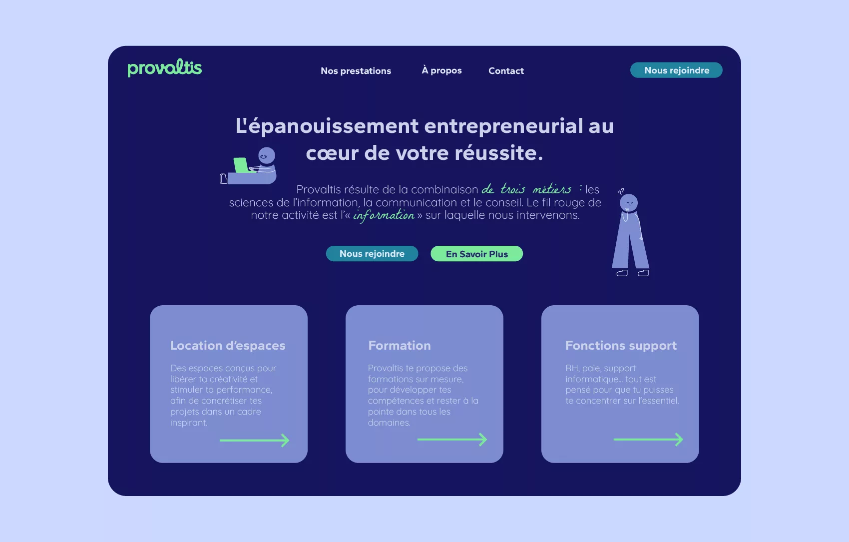
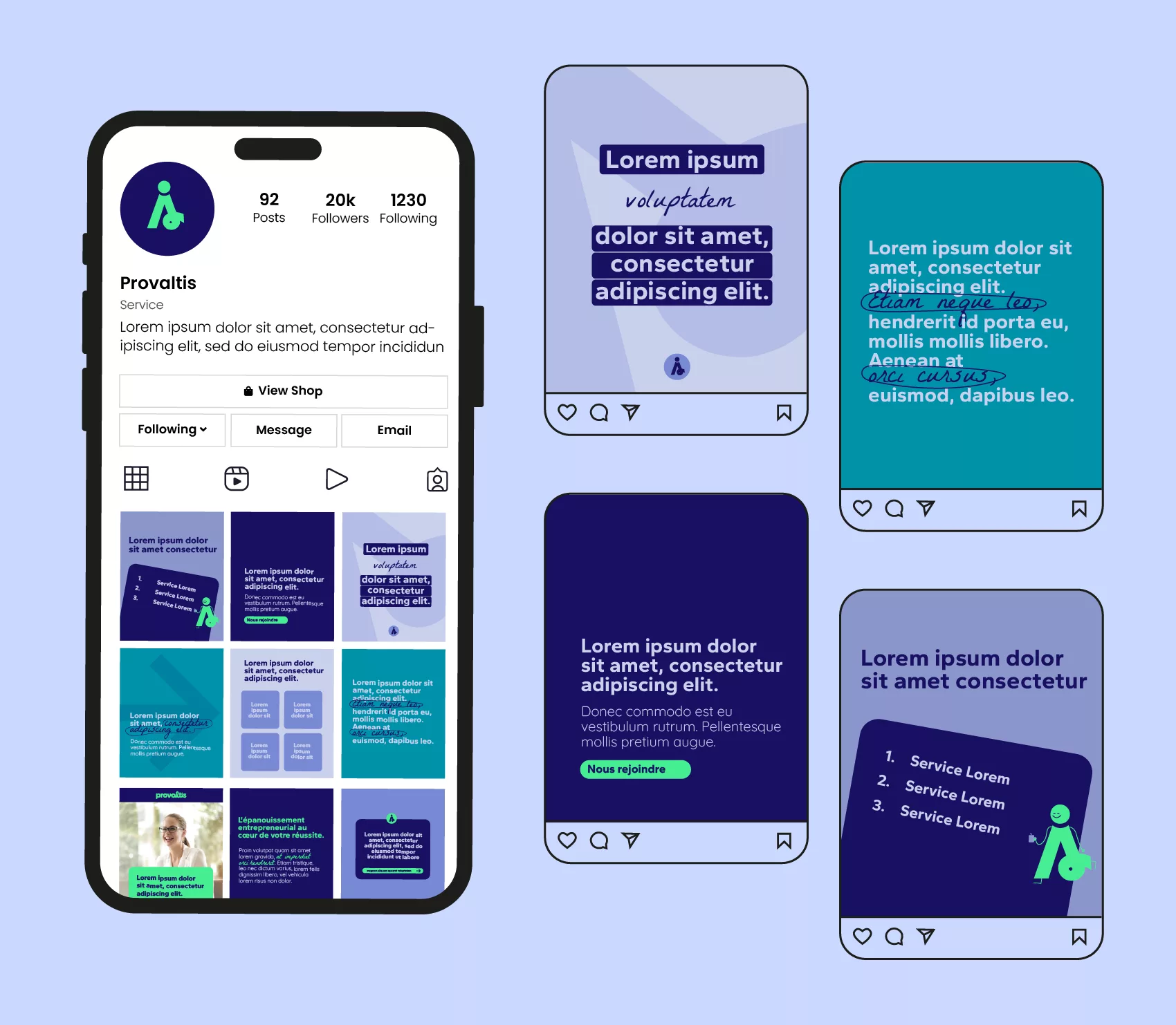
Provaltis
Provaltis is an ecosystem dedicated to entrepreneurs, designed as a place of resources, connections, and inspiration. The challenge of this visual identity was to accurately reflect this mission: to offer a brand image that feels both professional, human, and dynamic.
Overall Concept
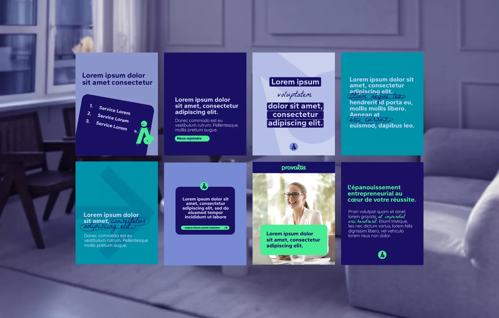
Provaltis’ identity is built around a strong duality: structure and human well-being. This contrast is expressed throughout the visual universe by combining clear, solid sans-serif typefaces with handwritten elements that bring warmth and spontaneity. Together, they form an identity that feels accessible, confident, and truly alive.
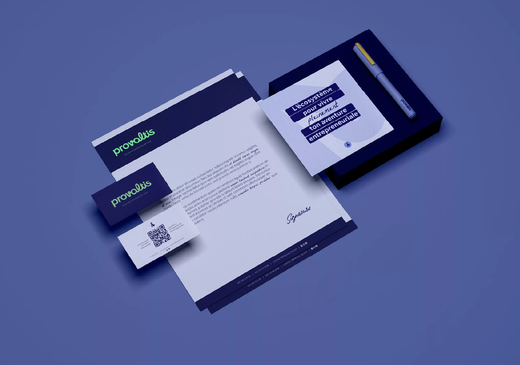
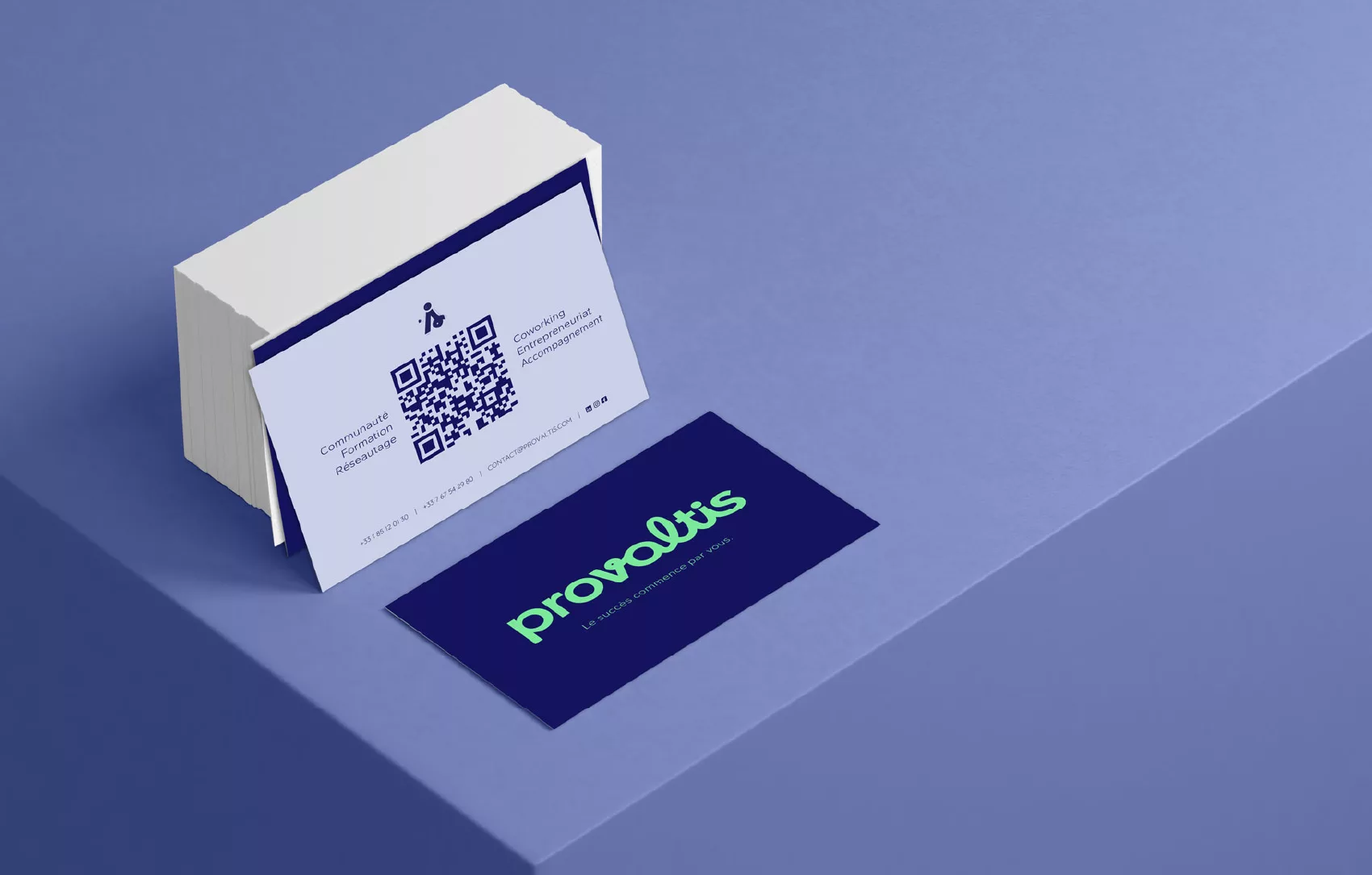
Logo
The brand logo explores several interpretations of this duality:
- A sans-serif base that reflects the project’s modernity and reliability.
- Integrated handwritten touches to reinforce the human connection.
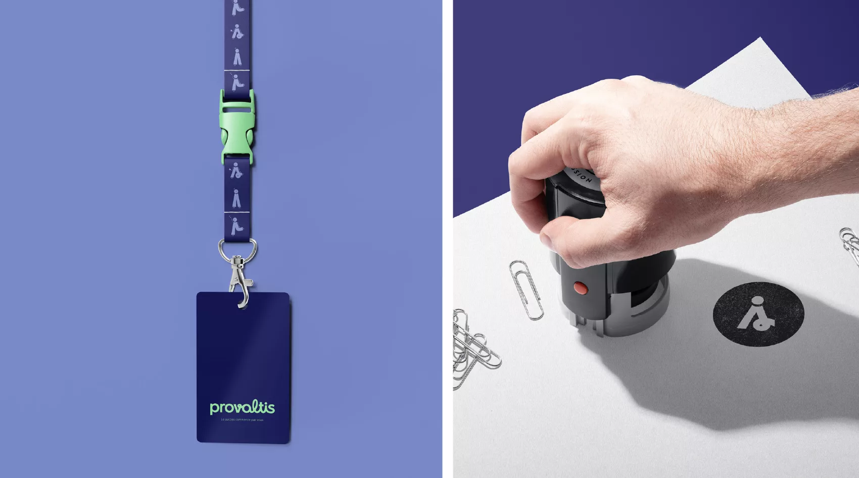
- A stylized icon version, playing with the “v” and the dot of the “i” to subtly suggest a human figure — symbolizing the personalized support at the heart of the ecosystem.
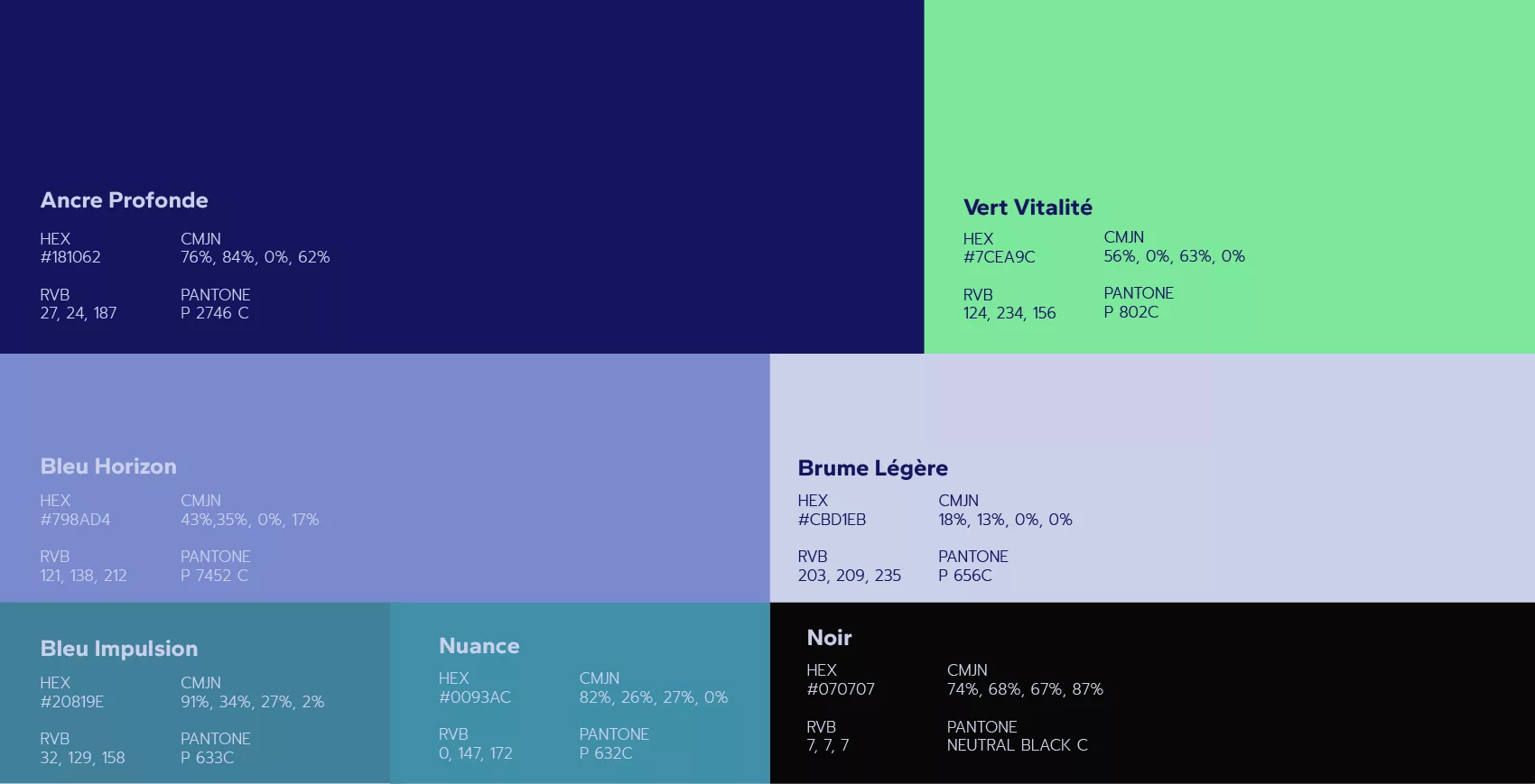
Color Palette
The color palette is grounded in reassuring blues (deep anchor, impulse blue, light mist…), contrasted with a vibrant accent color.
Each hue was chosen to represent a facet of the entrepreneurial journey: stability, optimism, freshness, or creativity.
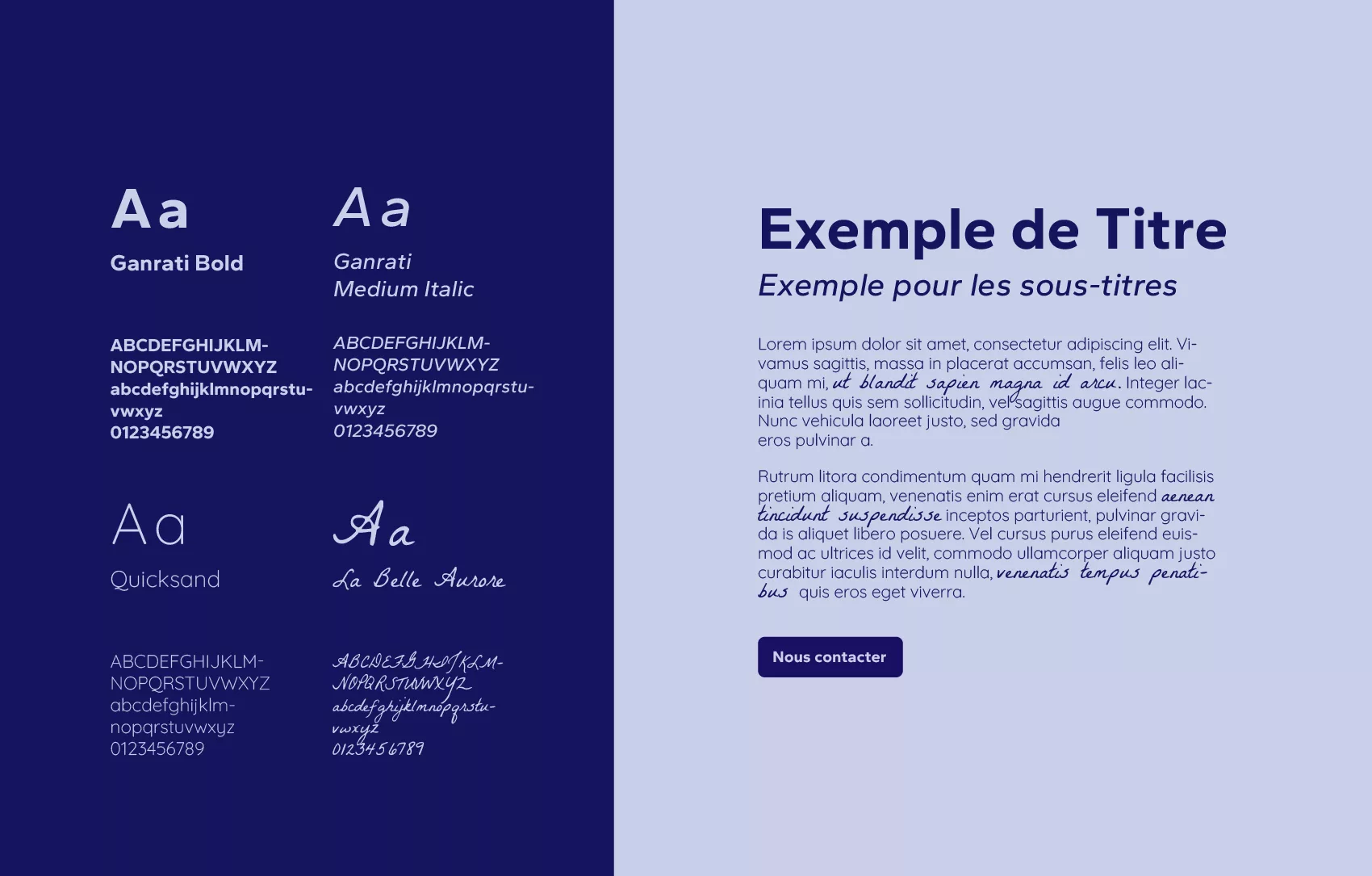
Typography
The final selection is a mix of legibility, modernity, and expression:
- Gantari for headings, with its strong and contemporary structure.
- Quicksand for body text, offering comfortable reading and visual softness.
- La Belle Aurore adds delicate handwritten accents, bringing character and authenticity to the brand’s tone.
Illustration & Mascot
The illustration universe is a direct extension of the logo.
Starting from the typographic structure of the logotype, a mascot was developed to embody the various states of mind entrepreneurs experience: reflection, motivation, doubt, victory, and more.
The design is intentionally minimalist yet expressive, with soft lines, imperfect shapes, and handwritten details. This approach results in a charming, adaptable character that aligns seamlessly with the overall identity.