RŌV is an experimental slow fashion label redefining the art of knitwear. The identity had to capture the essence of a project where every piece is a unique, instinct-driven creation. The goal? To visually translate the brand’s “magnetic arrogance”—a perfect balance between raw, handcrafted textures and a bold, premium visual impact.
Date : April 29, 2026
Deliverables:
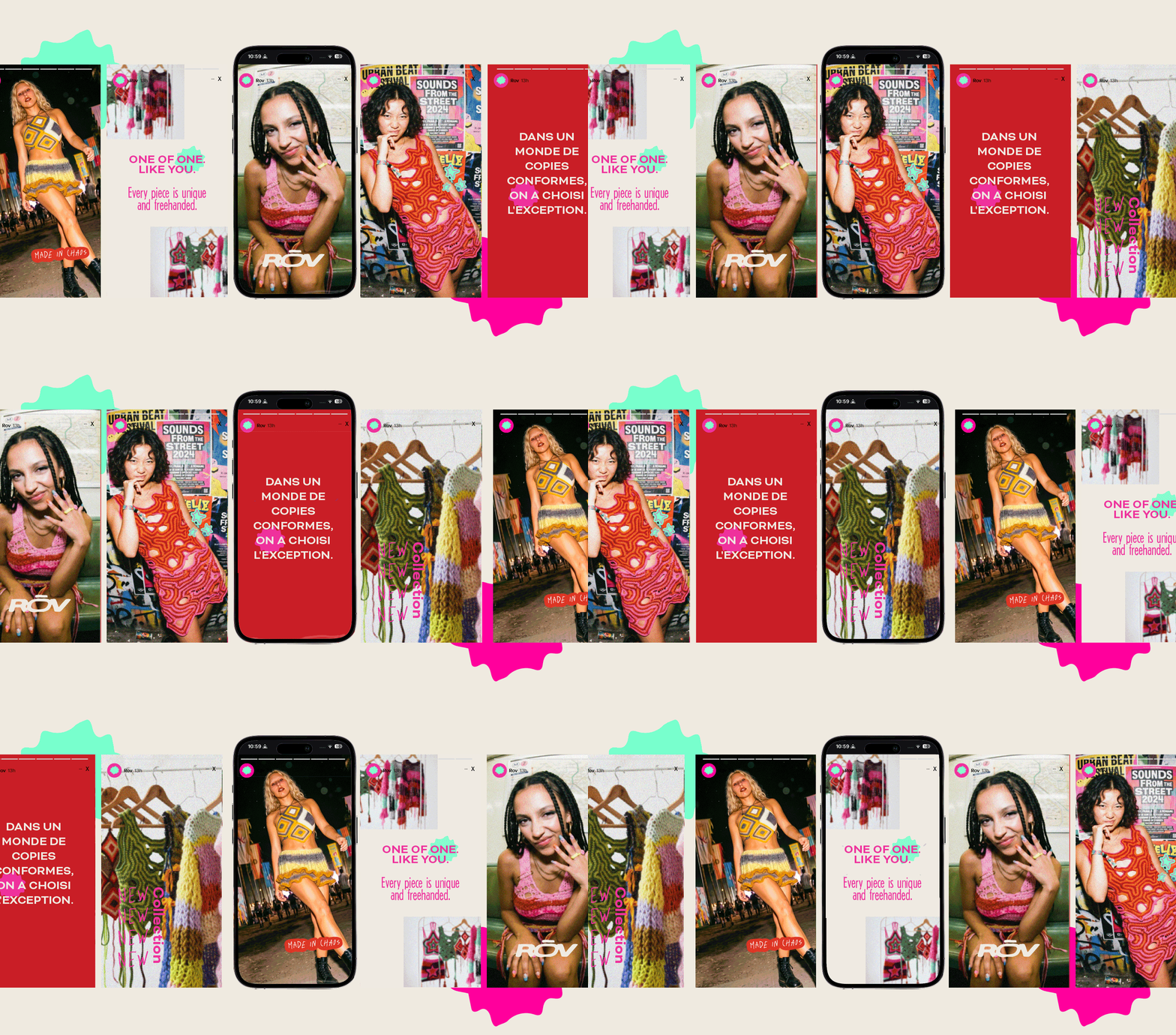
Full Branding, Photography Art Direction, and Brand Assets (Gift Cards, Thank You Cards, Woven Labels, Story Templates).
RŌV is built on the tension between material and attitude. The visual universe rejects traditional crochet codes in favor of an “Indie Luxe” aesthetic. Massive typography paired with spontaneous, handwritten touches creates an identity that doesn’t ask for permission to exist. A vibrant, uncompromising brand deeply rooted in the present moment.
Visual Identity Design
Logotype
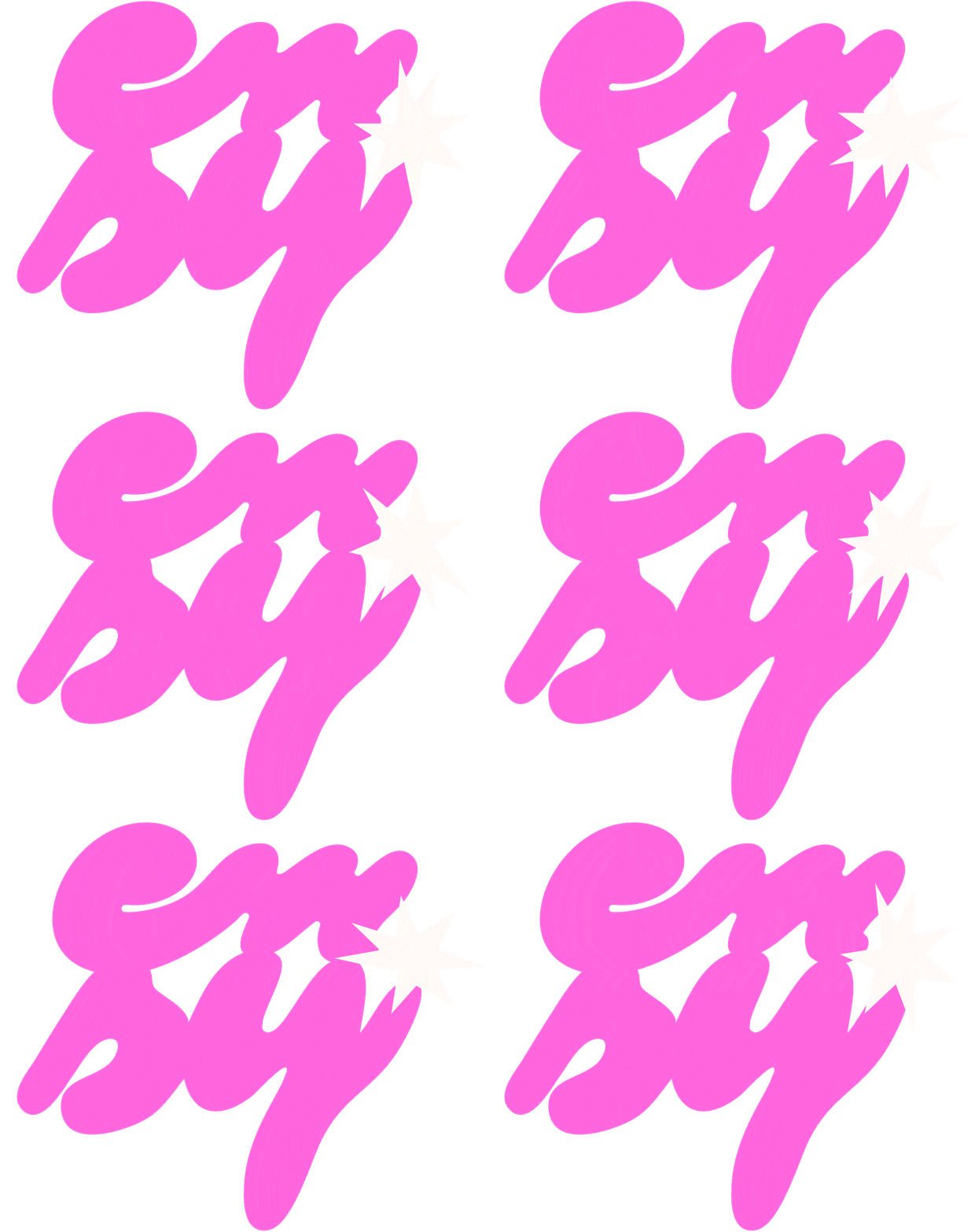
The logo was designed as a piece of visual architecture, using massive letterforms for an assertive, premium posture. Every detail is intentional:
The Tension: The stretched “Ō” symbolizes the tension of the yarn during the making process.
The Fusion: The letters merge together to evoke the interlocking mesh of wool.
The Imperfection: Grain and imperfect edges were added to honor the unique, artisanal nature of freehand work.
The Contrast: Handwritten doodles and an organic shape inspired by a crushed cotton flower “disrupt” the rigid structure, breathing in the freedom of creative chaos.
Colors
The palette is based on brutal, vibrant contrasts, designed for Dopamine Branding.
Vibrant Turquoise: A symbol of innovation and freshness.
Deep Blue & Black: For depth and a premium foundation.
Orange-Red: Capturing the raw, electric energy of festivals.
Intense Pink: Representing the “care” and attention poured into every handmade piece.
Typography Choices
The visual identity revolves around a balance between discipline and instinct:
Structure & Premium: A bold, all-caps sans-serif font provides the solidity and high-end feel of the label.
Instinct & Chaos: A grunge, “improper” handwritten font acts as a cry of pure instinct, visually translating the chaos of a pattern-less creative process.
Editorial Grunge: A mix that remains legible while asserting a modern, unique, and resolutely anti-polished look.
Art Direction & Details
The RŌV universe rejects “glossy” advertising in favor of a raw, authentic finish.
Direct Flash Photography: A gritty aesthetic choice that captures the energy of the moment and the festival vibe.
Physical Experience: The branding comes to life through tactile assets where matte meets gloss. “Made in Chaos” woven labels and hand-numbered cards certify each piece as a unique collector’s item.
This could be YOUR brand
Identities designed to fuel your ambition, not just look pretty.
J'utilise des cookies pour améliorer la navigation et analyser les visites. En acceptant, tu m'aides à rendre le site encore meilleur. Tu peux modifier tes préférences à tout moment.
Fonctionnel
Always active
Le stockage ou l’accès technique est strictement nécessaire dans le but légitime de permettre l’utilisation d’un service spécifique explicitement demandé par l’utilisateur, ou pour permettre la transmission d’une communication sur un réseau de communication électronique.
Preferences
The technical storage or access is necessary for the legitimate purpose of storing preferences that are not requested by the subscriber or user.
Statistiques
The technical storage or access that is used exclusively for statistical purposes.Le stockage technique ou l’accès est utilisé exclusivement à des fins statistiques anonymes. En l’absence d’une assignation, d’une conformité volontaire de la part de votre fournisseur d’accès à internet ou d’enregistrements supplémentaires provenant d’un tiers, les informations stockées à cette seule fin ne peuvent généralement pas être utilisées pour vous identifier.
Marketing
Le stockage ou l’accès technique est nécessaire pour créer des profils d’utilisateurs afin d’envoyer de la publicité, ou pour suivre l’utilisateur sur un site web ou sur plusieurs sites web à des fins de marketing similaires.